
Short Run Comix
Transforming the Seattle-based comic hub's brand and mobile UI
with a bold, vibrant reboot that packs a punch! 👊
INTRODUCTION
INTRODUCTION
Short Run — A Percolator of Comic Genius
Short Run —
A Percolator of Comic Genius
Short Run Comix
Website Redesign
Brand & Identity Design
Visual Design
Research
E-Commerce
Mobile App
Short Run is a unique creative hub dedicated to the medium of comics as a powerful coalescence of art and literature. As champions of the intimate, hands-on experience of holding a book, this nonprofit organization is Seattle’s go-to destination for indie comic book artists and lovers alike — fueling fans and creatives with opportunities, grants, educational programming, and vibrant community events.
Short Run is a unique creative hub dedicated to the medium of comics as a powerful coalescence of art and literature. As champions of the intimate, hands-on experience of holding a book, this nonprofit organization is Seattle’s go-to destination for indie comic book artists and lovers alike — fueling fans and creatives with opportunities, grants, educational programming, and vibrant community events.
Transforming the Seattle-based comic hub's brand and mobile UI with a bold, vibrant reboot that packs a punch! 👊
Short Run is a unique creative hub dedicated to the medium of comics as a powerful coalescence of art and literature. As champions of the intimate, hands-on experience of holding a book, this nonprofit organization is Seattle’s go-to destination for indie comic book artists and lovers alike — fueling fans and creatives with opportunities, grants, educational programming, and vibrant community events.
Context
Master's Project
HCDE @ UW (Solo)
Client
Short Run Comix
www.shortrun.org
My Role(s)
UX Researcher
UX / UI Designer
Timeline
Three (3) Weeks
November 2023
Toolkit
Context
Master's Project
HCDE @ UW (Solo)
Client
Short Run Comix
www.shortrun.org
My Role(s)
UX Researcher
UX / UI Designer
Timeline
Three (3) Weeks
November 2023
Context & Contribution
Context & Contribution
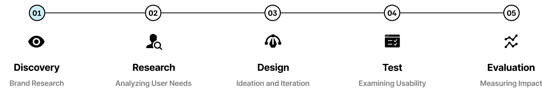
As part of my graduate program in Human-Centered Design & Engineering at UW, I tackled a (3) three-week solo sprint to (1) reimagine Short Run’s brand and (2) design a new task flow for their mobile website.
This conceptual redesign followed a structured timeline, focusing primarily on brand research and visual design. While this project was limited to one design iteration due to course constraints, future refinements would involve additional stakeholder interviews and user research, usability testing, and iterative feedback cycles.

Blending branding, usability, and visual design, I crafted a refreshed identity, streamlined key UX flows, and delivered a dynamic UI redesign that captures Short Run's creative spirit while enhancing both clarity and character.
Below are a few of the process highlights:
Blending branding, usability, and visual design, I crafted a refreshed identity, streamlined key UX flows, and delivered a dynamic UI redesign that captures Short Run's creative spirit while enhancing both clarity and character.
Below are a few of the process highlights:
Blending branding, usability, and visual design, I crafted a refreshed identity, streamlined key UX flows, and delivered a dynamic UI redesign that captures Short Run's creative spirit while enhancing both clarity and character.

I explored Short Run's mission, vision, and values to ensure alignment and defined a creative direction that reflects its bold, offbeat identity.
I conducted a heuristic evaluation to uncover key usability issues and used guerrilla research to gather insights directly from the community.

I analyzed existing site flows and reimagined them to enhance content discoverability, streamline navigation, and create a seamless experience.

I developed a distinct brand and visual style to give the interface a vibrant, comic-inspired reboot that brings Short Run's energy to life.
Please Note: This project is a conceptual design study created for a visual communication class and is not officially affiliated with Short Run.
Please Note: This project is a conceptual design study created for a visual communication class and is not officially affiliated with Short Run.
SOLUTION OVERVIEW
SOLUTION OVERVIEW
TLDR: The Short (Run) Version
TLDR: The Short (Run) Version
Too long, didn't read? No worries — I've got you covered.
Here's the rundown of the redesign: what wasn't working, how I fixed it, and why it matters. From a bolder brand identity to a more efficient user experience, this project transforms Short Run's mobile website into a space that's as dynamic, engaging, and full of character as the comics and creators it champions.
The Problem Space
Bold Brand, Bland Experience
Bold Brand, Bland Experience
Short Run is a creative powerhouse, but its website isn't telling the full story.
Buried content, missing information, and an underwhelming brand presence fail to capture Short Run's energy and mission and create barriers to engagement.
As a result, fans and artists struggle to connect and discover new opportunities for engagement.
With that in mind…

The Solution
Short Run, Reimagined
Short Run, Reimagined
The redesigned Short Run experience brings personality and seamless interaction to the forefront. With a bold and expressive brand identity, streamlined navigation, and improved content discoverability, the new design makes it easier than ever for fans & artists to connect, explore, and engage with this thriving creative community.
The redesigned Short Run experience brings personality and seamless interaction to the forefront. With a bold and expressive brand identity, streamlined navigation, and improved content discoverability, the new design makes it easier than ever for fans & artists to connect, explore, and engage with this thriving creative community.
The redesigned Short Run experience brings personality and seamless interaction to the forefront. With a bold and expressive brand identity, streamlined navigation, and improved content discoverability, the new design makes it easier than ever for fans & artists to connect, explore, and engage with this thriving creative community.


A Bold, Vibrant Reboot
A dynamic, comic-inspired redesign that captures Short Run’s energy with a visually striking, intuitive mobile interface — bringing clarity, personality, and usability to the forefront.


Effortless Engagement
A streamlined and seamless event registration flow makes discovering and signing up for workshops frustration-free, ensuring users can easily connect with Short Run’s creative community.
Curate Your Collection
Discovering and purchasing indie comics is now a smooth, intuitive, and enjoyable process — making it easier than ever to support local artists and curate your unique collection of comics.

Hypothesized Impact
A Redesign That Resonates
A Redesign That Resonates
By infusing more pop and personality into the brand, the new design strengthens Short Run's visibility and better communicates its mission. Prominent CTAs, improved content discoverability, and a more intuitive interface make it easier for users to find key information and explore opportunities, increasing engagement and fostering deeper connections within the community — helping Short Run thrive both online and beyond.
By infusing more pop and personality into the brand, the new design strengthens Short Run's visibility and better communicates its mission. Prominent CTAs, improved content discoverability, and a more intuitive interface make it easier for users to find key information and explore opportunities, increasing engagement and fostering deeper connections within the community — helping Short Run thrive both online and beyond.
By infusing more pop and personality into the brand, the new design strengthens Short Run's visibility and better communicates its mission. Prominent CTAs, improved content discoverability, and a more intuitive interface make it easier for users to find key information and explore opportunities, increasing engagement and fostering deeper connections within the community — helping Short Run thrive both online and beyond.

Stronger Brand
Identity & Visibility
Stronger Brand
Identity & Visibility

Boosted Community
Engagement
Boosted Community
Engagement

Improved Usability
& Content Discoverability
Improved Usability
& Content Discoverability
THE CHALLENGE
THE CHALLENGE
Comic fans and artists struggle to connect within the community and discover new opportunities for education and support.
Comic fans and artists struggle to connect within the community and discover new opportunities for education and support.
Comic fans and artists struggle to connect within the community and discover new opportunities for education and support.
The design challenge was to redesign the visual interface of Short Run's mobile website, with particular emphasis on a singular task flow. After evaluating the website, I chose to focus on establishing a flow for registering for one of the organization's educational workshops, which was nearly *nonexistent*.
As a bonus, I created screens for an online bookstore, as their micropress offerings currently link to Short Run's Etsy page.
BRAND DISCOVERY
BRAND DISCOVERY
The Origin Story
The Origin Story
Every great design starts with a deep understanding of the brand it represents. Before diving into solutions, I explored Short Run’s identity — its mission, vision, values, and the unique energy that fuels its creative community.
Every great design starts with a deep understanding of the brand it represents. Before diving into solutions, I explored Short Run’s identity — its mission, vision, values, and the unique energy that fuels its creative community.
Every great design starts with a deep understanding of the brand it represents. Before diving into solutions, I explored Short Run’s identity — its mission, vision, values, and the unique energy that fuels its creative community.
The Organization
Defining Short Run
Defining Short Run
Short Run is more than a comics festival — it’s a creative hub that champions indie artists, fosters community, and celebrates comics as an art form.
Understanding its mission and values ensured that every design decision aligned with what makes Short Run unique.
Short Run is more than a comics festival — it’s a creative hub that champions indie artists, fosters community, and celebrates comics as an art form.
Understanding its mission and values ensured that every design decision aligned with what makes Short Run unique.
Short Run is more than a comics festival — it’s a creative hub that champions indie artists, fosters community, and celebrates comics as an art form.
Understanding its mission and values ensured that every design decision aligned with what makes Short Run unique.

Brand Keywords
Capturing Short Run's Essence
Capturing Short Run's Essence
Brand keywords are more than descriptors; they
set the tone for the brand's identity and ensure design choices reflect its mission, values, and personality.
With these words, I aimed to capture Short Run's essence: its vibrant look, strong sense of community, and unapologetically quirky spirit.
Brand keywords are more than descriptors; they set the tone for the brand's identity and ensure design choices reflect its mission, values, and personality.
With these words, I aimed to capture Short Run's essence: its vibrant look, strong sense of community, and unapologetically quirky spirit.
Brand keywords are more than descriptors; they
set the tone for the brand's identity and ensure design choices reflect its mission, values, and personality.
With these words, I aimed to capture Short Run's essence: its vibrant look, strong sense of community, and unapologetically quirky spirit.
Mood Board
Character + Color + Curated Chaos
Character + Color + Curated Chaos
Before diving into design, I curated a mood board to discover Short Run's current visual identity — capturing its bold creativity, playful energy, and offbeat charm.
Dynamic. Unconventional. Quirky. Fearless. And just a little bit chaotic.
Before diving into design, I curated a mood board to discover Short Run's current visual identity — capturing its bold creativity, playful energy, and offbeat charm.
Dynamic. Unconventional. Quirky. Fearless. And just a little bit chaotic.
Before diving into design, I curated a mood board to discover Short Run's current visual identity — capturing its bold creativity, playful energy, and offbeat charm.
Dynamic. Unconventional. Quirky. Fearless. And just a little bit chaotic.

Brand Audit
SWOT Analysis
SWOT Analysis
By analyzing Short Run’s strengths, weaknesses, opportunities, and threats, I identified key gaps in its brand presence. These insights informed a redesign that enhances brand presence and identity, improves usability, and strengthens connections between artists and audiences.
By analyzing Short Run’s strengths, weaknesses, opportunities, and threats, I identified key gaps in its brand presence. These insights informed a redesign that enhances brand presence and identity, improves usability, and strengthens connections between artists and audiences.
By analyzing Short Run’s strengths, weaknesses, opportunities, and threats, I identified key gaps in its brand presence. These insights informed a redesign that enhances brand presence and identity, improves usability, and strengthens connections between artists and audiences.


RESEARCH & EVALUATION
RESEARCH & EVALUATION
Unmasking the Issues
Unmasking the Issues
Now that I had a better understanding of Short Run's mission and brand, it was time to dive into the research phase.
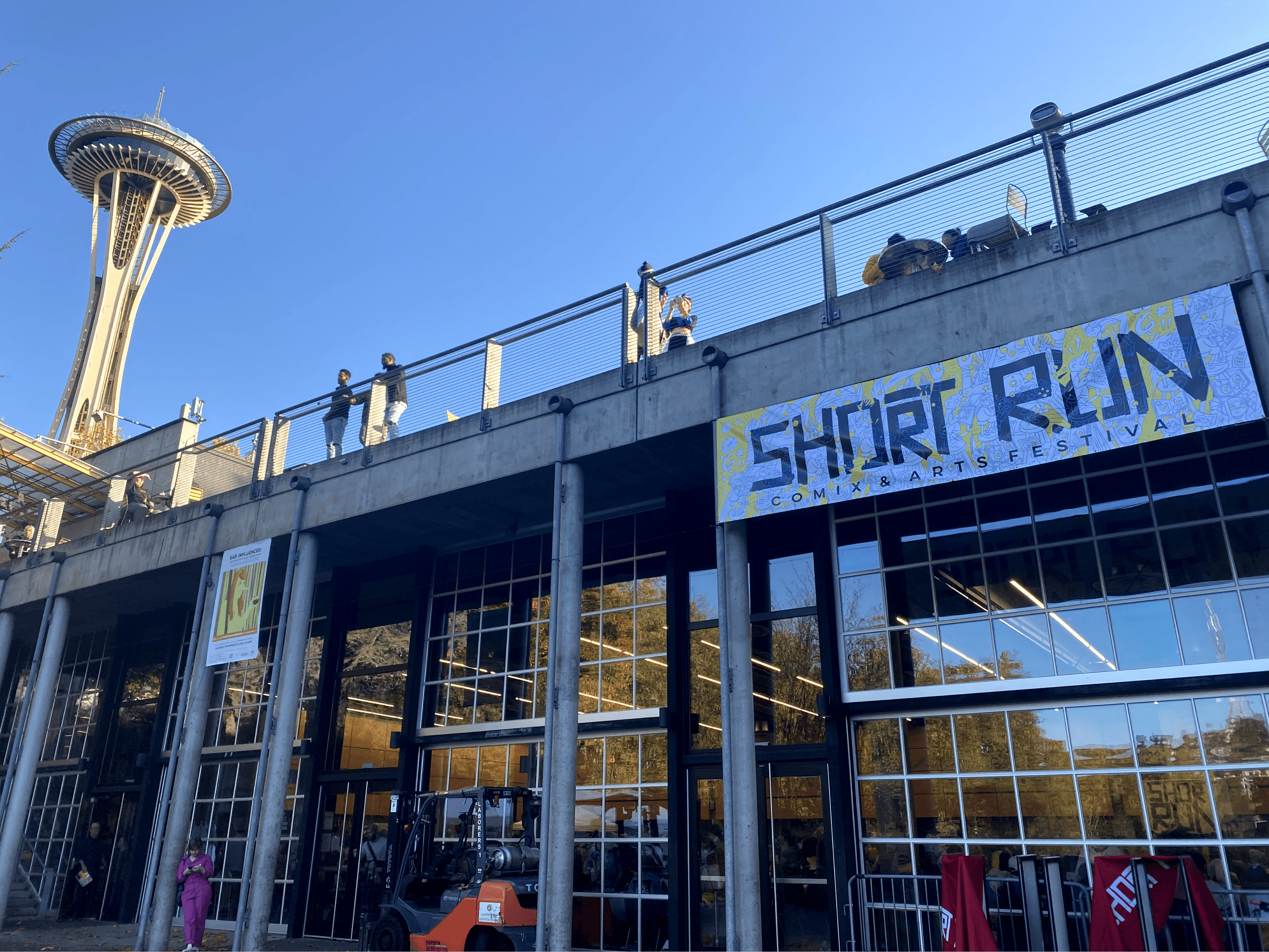
I conducted a heuristic evaluation to pinpoint website usability issues and gathered real-world insights by attending Short Run’s Comix & Arts Festival — observing users in action and speaking directly with artists, organizers, and attendees.
Now that I had a better understanding of Short Run's mission and brand, it was time to dive into the research phase. I conducted a heuristic evaluation to pinpoint website usability issues and gathered real-world insights by attending Short Run’s Comix & Arts Festival — observing users in action and speaking directly with artists, organizers, and attendees.
Now that I had a better understanding of Short Run's mission and brand, it was time to dive into the research phase. I conducted a heuristic evaluation to pinpoint website usability issues and gathered real-world insights by attending Short Run’s Comix & Arts Festival — observing users in action and speaking directly with artists, organizers, and attendees.
Brand
Discovery
Heuristic
Evaluation
Guerrilla
Research
Heuristic Evaluation
Identifying the Kryptonite
Identifying the Kryptonite
Even the strongest user experiences have their Kryptonite — hidden weaknesses that create friction, confusion, or frustration. To uncover these pain points, I conducted a heuristic evaluation of Short Run’s mobile experience using Jakob Nielsen’s 10 Usability Heuristics for User Interface Design.
By identifying these usability flaws, I discovered key areas of improvement, uncovering the need for a brand new user flow and laying the groundwork for a more seamless, intuitive, and user-friendly redesign.
Heuristic Analysis
Uncovering the Pain Points
Uncovering the Pain Points
From the heuristic evaluation, I identified the following key pain points for the current mobile website:
From the heuristic evaluation, I identified the following key pain points for the current mobile website:
From the heuristic evaluation, I identified the following key pain points for the current mobile website:

Brand Inconsistency
The mobile website lacks the bold, playful energy that defines Short Run's identity and hides its mission.
Event Registration Barriers
There is no current process for registering for workshops or events online; users must leave the site to email the organization directly for information, disrupting the user flow and discouraging participation.
Inefficient, Unappealing Navigation
The non-fixed navigation is bulky and disappears while scrolling, making it visually unappealing and inefficient to navigate.
Cognitive Overload
Dense blocks of text make content tedious to read and difficult to scan; key organizational information is buried.
Guerrilla Research
Festival Fieldwork: Short Run's Audience in Action
Festival Fieldwork: Short Run's Audience in Action
Short Run’s annual Comix and Arts Festival provided the perfect opportunity for on-the-ground research. Attending in person allowed me to observe Short Run's audience, engage with organizers, artists, and enthusiasts, and gain firsthand insights into both Short Run’s mission and the needs of its community.
Short Run’s annual Comix and Arts Festival provided the perfect opportunity for on-the-ground research. Attending in person allowed me to observe Short Run's audience, engage with organizers, artists, and enthusiasts, and gain firsthand insights into both Short Run’s mission and the needs of its community.
Short Run’s annual Comix and Arts Festival provided the perfect opportunity for on-the-ground research. Attending in person allowed me to observe Short Run's audience, engage with organizers, artists, and enthusiasts, and gain firsthand insights into both Short Run’s mission and the needs of its community.


Insight
Disconnection Between In-Person and Online Brand Presence
Attendees were highly engaged, passionate, and eager to connect. Yet — outside of the annual festival — many didn't realize there were opportunities for further engagement, highlighting gaps in the brand's online presence and issues with content discoverability.
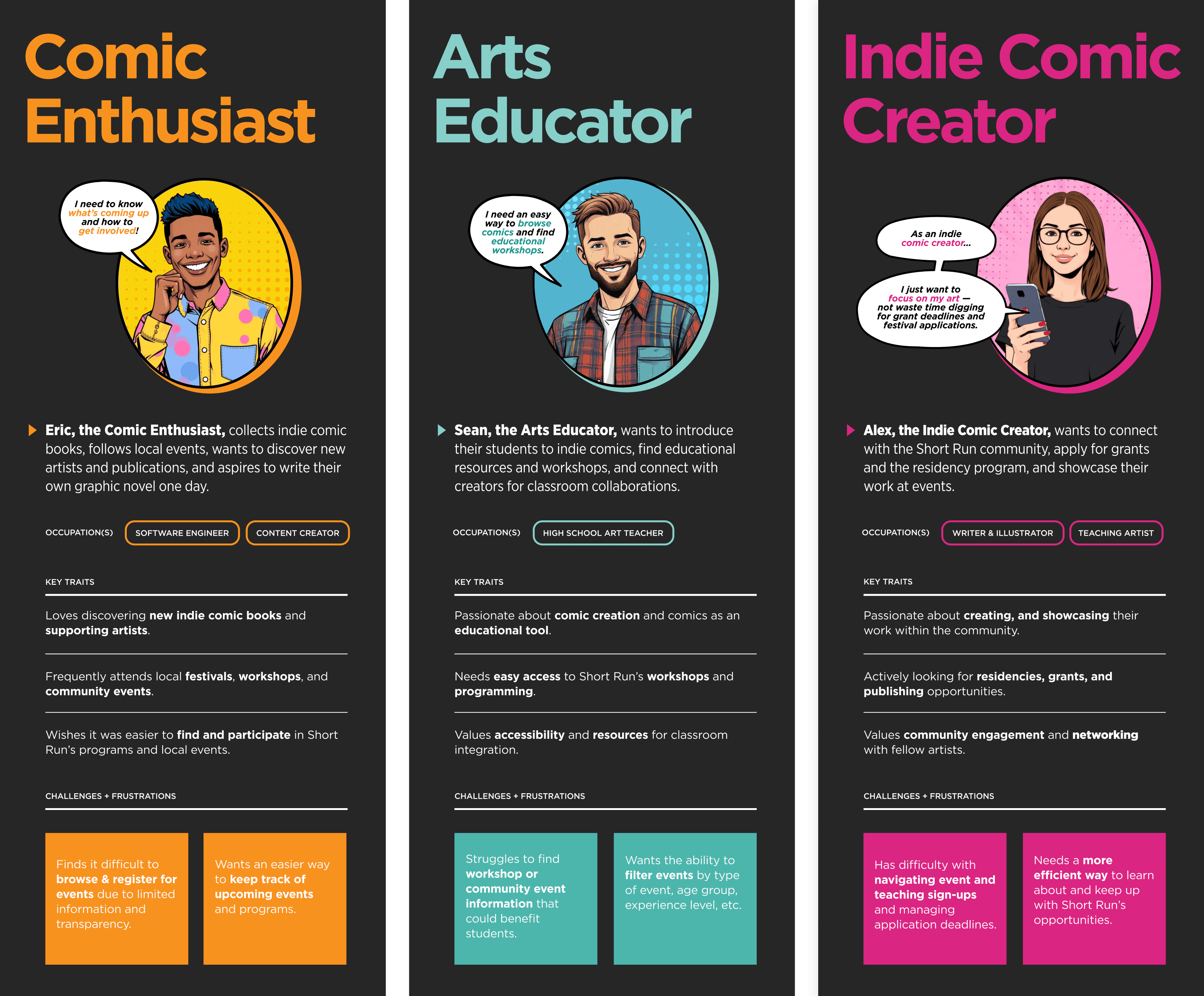
Persona Development
Meet the Users
Meet the Users
Every character has a backstory. After observing and interacting with Short Run's audience, I distilled my research into three (3) key personas: Eric the Comic Enthusiast, Alex the Indie Comic Creator, and Sean the Arts Educator.
Meet the artists, educators, and enthusiasts who bring Short Run to life — and the users I'm designing for.


DESIGN PROCESS
DESIGN PROCESS
How might we reimagine and infuse personality into Short Run's brand, enhance content discoverability, and transform the event registration process into an effortless user experience?
How might we reimagine and infuse personality into Short Run's brand, enhance content discoverability, and transform the event registration process into an effortless user experience?
How might we reimagine and infuse personality into Short Run's brand, enhance content discoverability, and transform the event registration process into an effortless user experience?
Design Goals
(Re)design Goals
(Re)design Goals
Short Run’s real-world presence is bold, dynamic, and community-driven — but its website doesn’t reflect that energy.
This redesign aims to create a more visually compelling and user-friendly experience by enhancing usability and improving brand identity and content discoverability, leading to higher engagement, clearer communication, and
a more prominent online presence.
Short Run’s real-world presence is bold, dynamic, and community-driven — but its website doesn’t reflect that energy.
This redesign aims to create a more intuitive, visually compelling,
and user-friendly experience for Short Run’s audience. By enhancing usability, refining brand identity, and improving discoverability, the new design should drive higher engagement, clearer communication, and a more prominent online presence.
Short Run’s real-world presence is bold, dynamic, and community-driven — but its website doesn’t reflect that energy.
This redesign aims to create a more visually compelling and user-friendly experience by enhancing usability and improving brand identity and content discoverability, leading to higher engagement, clearer communication, and
a more prominent online presence.

Stronger Connection to Brand Identity
Stronger Connection to Brand Identity
Ensure Short Run's mission, values, and offerings are clearly communicated.
Ensure Short Run's mission, values, and offerings are clearly communicated.
A Bold and Vibrant Brand Reboot
A Bold and Vibrant Brand Reboot
Develop a cohesive, unifying brand that is playful, creative, offbeat, & energetic — yet adaptable for diverse uses.
Develop a cohesive, unifying brand that is playful, creative, offbeat, & energetic — yet adaptable for diverse uses.
Increased Engagement & Interaction
Increased Engagement & Interaction
Encourage users to spend more time exploring Short Run's educational programming and opportunities.
Encourage users to spend more time exploring Short Run's educational programming and opportunities.
Enhanced Usability & Content Discoverability
Enhanced Usability & Content Discoverability
Improve site navigation and reduce cognitive load.
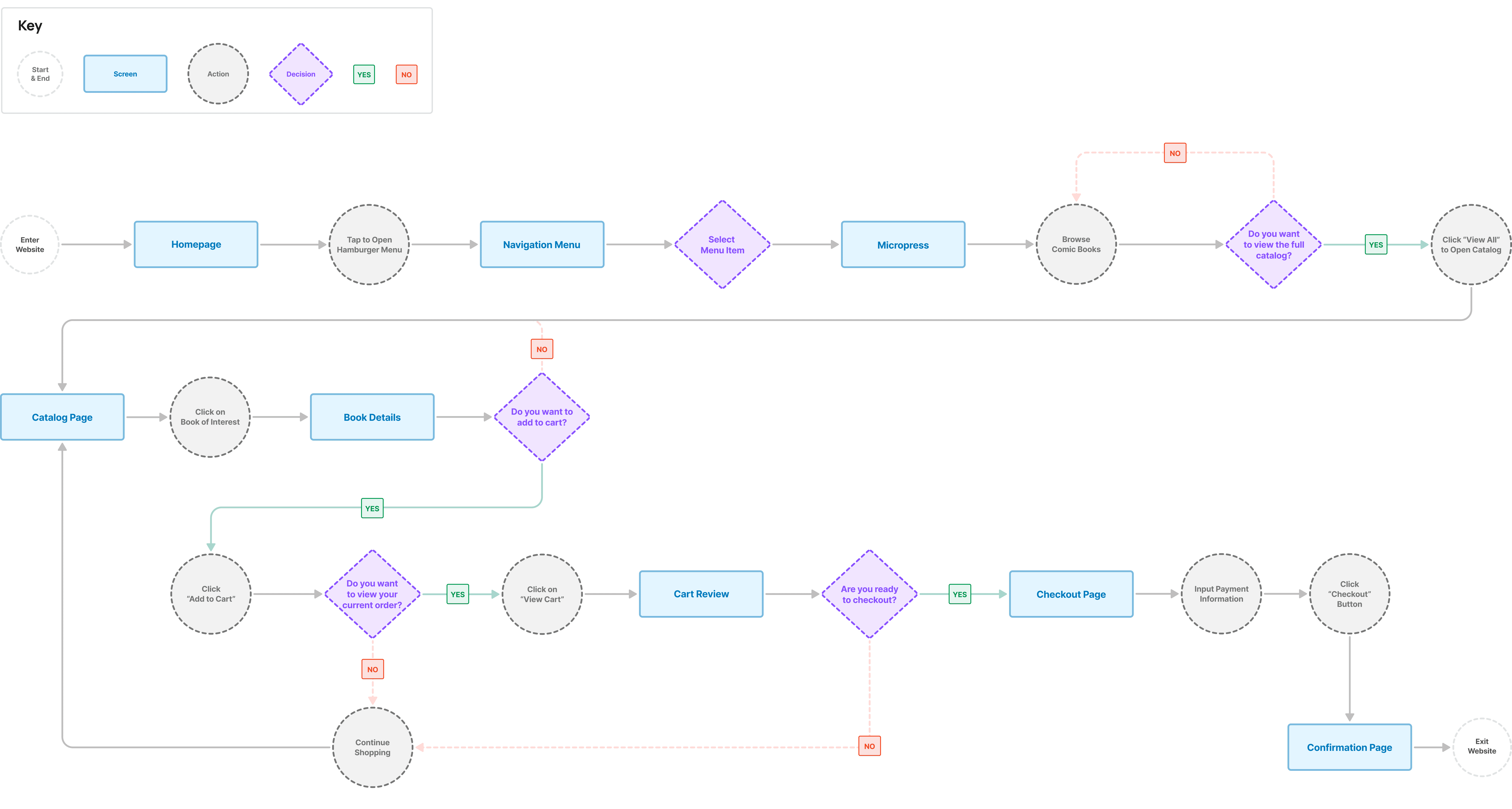
Task & User Flows
From Frustration to Function: Fixing the Flow
From Frustration to Function: Fixing the Flow
The original website’s navigation and content structure made discovery difficult. I mapped out the existing "registration" flow, then redesigned it to create a more seamless and efficient experience for visitors.
The original website’s navigation and content structure made discovery difficult. I mapped out the existing "registration" flow, then redesigned it to create a more seamless and efficient experience for visitors.
The original website’s navigation and content structure made discovery difficult. I mapped out the existing "registration" flow, then redesigned it to create a more seamless and efficient experience for visitors.
Original Task Flow

Redesigned Task Flow

Building on task flow improvements, I mapped end-to-end user flows, ensuring a seamless experience from discovery to action. I focused on two interactions: (1) registering for a workshop and (2) purchasing a graphic novel. The redesigned flows simplify navigation, reduce friction, and empower users to engage with Short Run's offerings effortlessly.
Building on task flow improvements, I mapped end-to-end user flows, ensuring a seamless experience from discovery to action. I focused on two interactions: (1) registering for a workshop and (2) purchasing a graphic novel. The redesigned flows simplify navigation, reduce friction, and empower users to engage with Short Run's offerings effortlessly.
Building on task flow improvements, I mapped end-to-end user flows, ensuring a seamless experience from discovery to action. I focused on two interactions: (1) registering for a workshop and (2) purchasing a graphic novel. The redesigned flows simplify navigation, reduce friction, and empower users to engage with Short Run's offerings effortlessly.
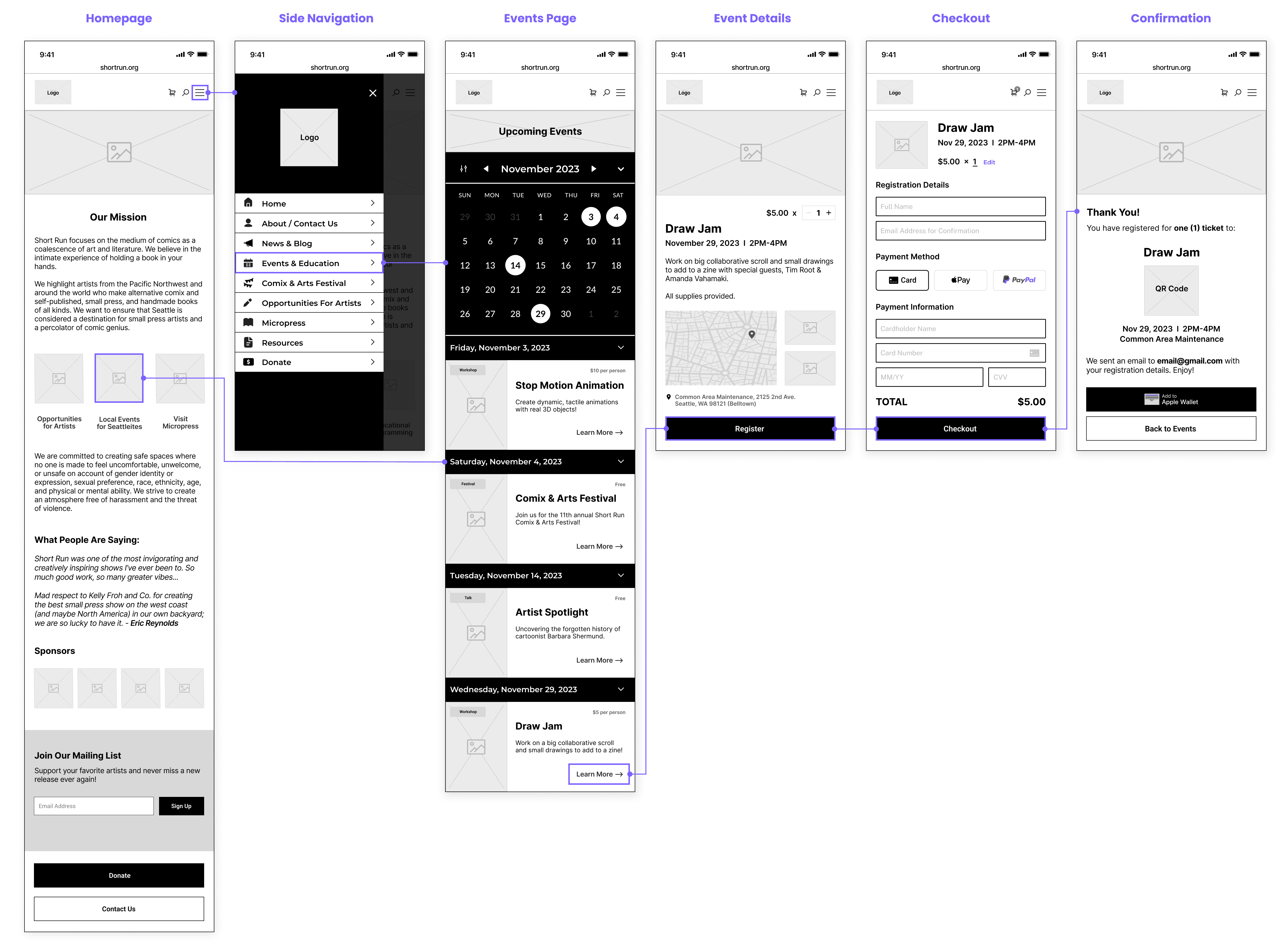
(1) Register for an Educational Workshop
Scenario: Sean, an arts educator, wants to sign up for a educational workshop with Short Run.
Scenario: Sean, an arts educator, wants to sign up for a educational workshop with Short Run.

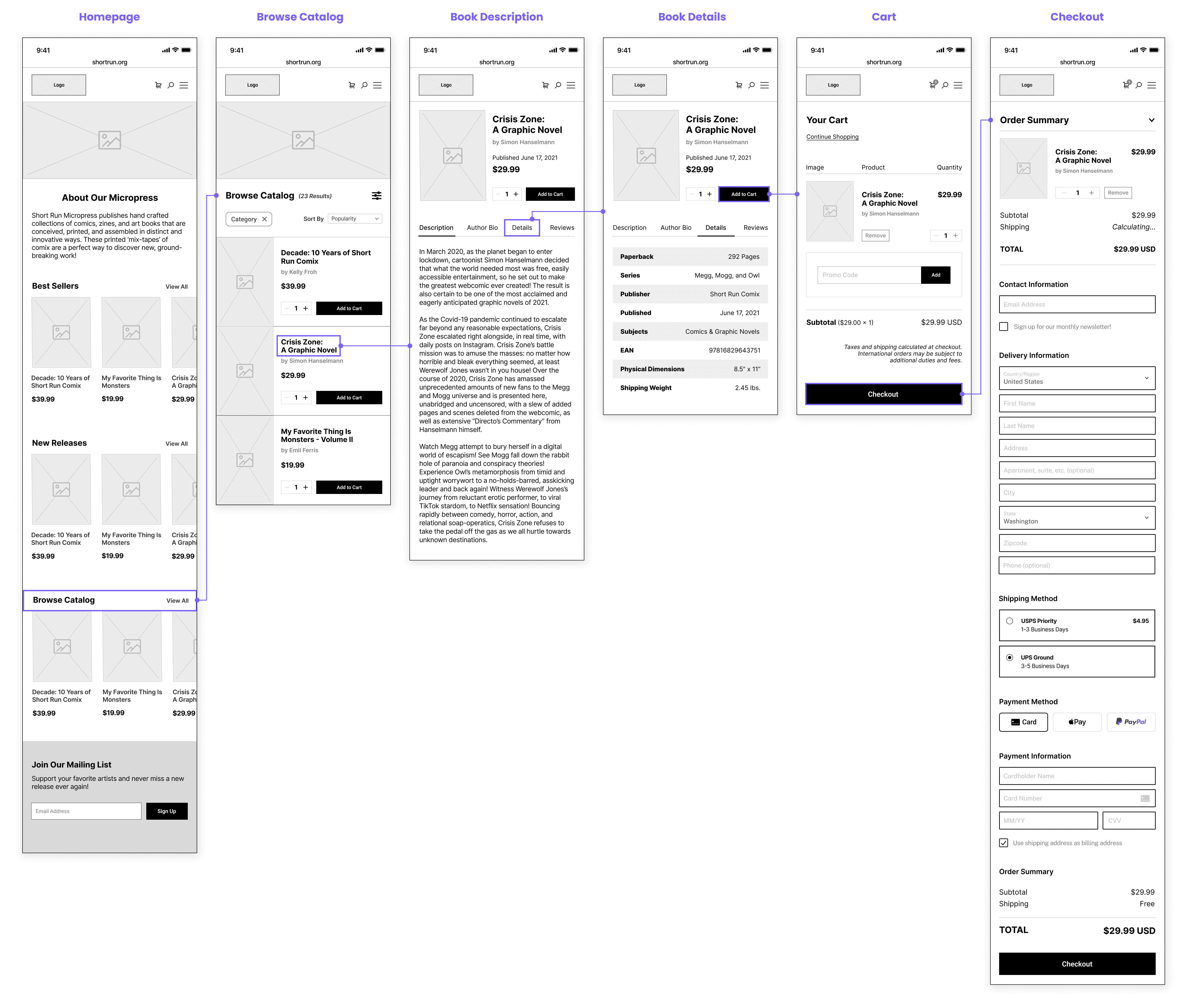
(2) Purchase a New Graphic Novel
Scenario: Eric, a comic enthusiast, wants to purchase a new graphic novel to read.
Scenario: Eric, a comic enthusiast, wants to purchase a new graphic novel to read.
MID-FIDELITY WIREFRAMES
MID-FIDELITY WIREFRAMES
Wireframe Mockups
With user flows defined, I translated them into mid-fidelity wireframes to visualize the redesigned event registration and book purchasing journeys. These wireframes focused on structure, layout, content, and functionality, creating a user-friendly foundation to iterate on before diving into visual design.
With user flows defined, I translated them into mid-fidelity wireframes to visualize the redesigned event registration and book purchasing journeys. These wireframes focused on structure, layout, content, and functionality, creating a user-friendly foundation to iterate on before diving into visual design.
With user flows defined, I translated them into mid-fidelity wireframes to visualize the redesigned event registration and book purchasing journeys. These wireframes focused on structure, layout, content, and functionality, creating a user-friendly foundation to iterate on before diving into visual design.
Event Registration Flow
Purchase Flow
VISUAL STYLE GUIDE
VISUAL STYLE GUIDE
Designing the Interface
Designing the Interface
Short Run is bold, playful, and unconventional — its website should be too.
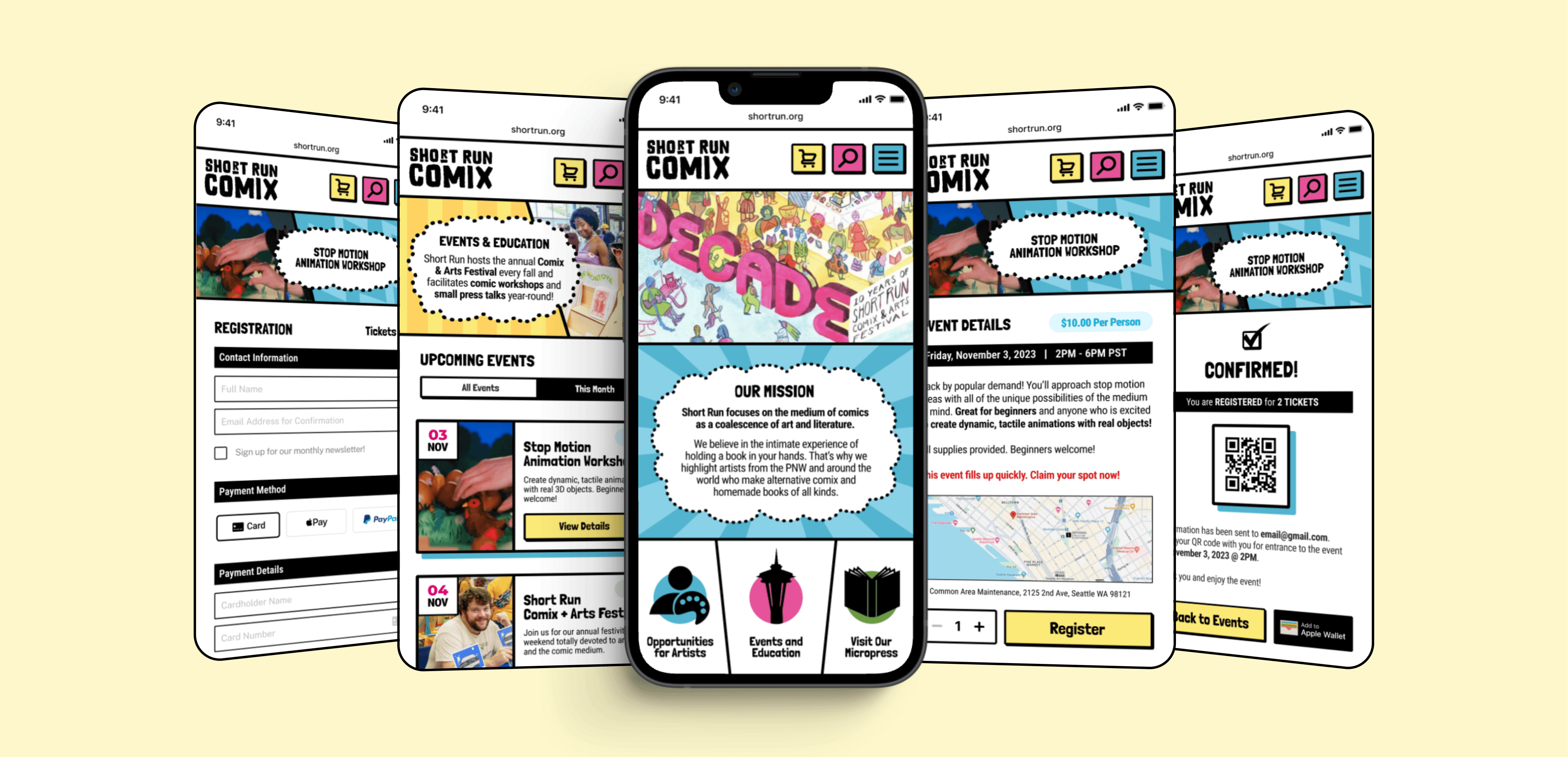
For the visual design, I played with the concept of a bold comic-style interface that felt hand-drawn and expressive.
I leaned into the cartoonish quality with dark, heavy lines and loud, bright colors. I refreshed the logo, but still kept it simplistic in B&W for brand flexibility, as Short Run often changes up their color palette and artwork style.
Short Run is bold, playful, and unconventional — its website should be too.
For the visual design, I played with the concept of a bold comic-style interface that felt hand-drawn and expressive. I leaned into the cartoonish quality with dark, heavy lines and loud, bright colors. I refreshed the logo, but still kept it simplistic in B&W for brand flexibility, as Short Run often changes up their color palette and artwork style.

FINAL SOLUTION
FINAL SOLUTION
High-Fidelity Mockups
High-Fidelity Mockups
I transformed the wireframes into high-fidelity mockups, crafting a bold, intuitive interface that closely aligns with Short Run's brand identity and quirky personality.
I transformed the wireframes into high-fidelity mockups, crafting a bold, intuitive interface that closely aligns with Short Run's brand identity and quirky personality.
Reimagined Design
The Event Registration Redemption Arc
The Event Registration Redemption Arc
Registering for an event shouldn’t feel like an obstacle course. The original process required users to navigate away from the site and reach out via email, creating unnecessary friction. The redesigned flow introduces on-site registration with clear CTAs, so users can sign up in seconds.
Registering for an event shouldn’t feel like an obstacle course. The original process required users to navigate away from the site and reach out via email, creating unnecessary friction. The redesigned flow introduces on-site registration with clear CTAs, so users can sign up in seconds.
Registering for an event shouldn’t feel like an obstacle course. The original process required users to navigate away from the site and reach out via email, creating unnecessary friction. The redesigned flow introduces on-site registration with clear CTAs, so users can sign up in seconds.
BOOM! A Better Way to Buy
BOOM! A Better Way to Buy
Discovering your next adventure shouldn't feel like a boss battle. The original site made browsing Short Run's
offerings difficult, with no direct purchasing options. The new design simplifies discovery, highlights featured works,
and introduces an easy checkout process, so every comic fan can jump straight into their next story without the hassle.
Discovering your next adventure shouldn't feel like a boss battle. The original site made browsing Short Run's offerings difficult, with no direct purchasing options. The new design simplifies discovery, highlights featured works, and introduces an easy checkout process, so every comic fan can jump straight into their next story without the hassle.
Discovering your next adventure shouldn't feel like a boss battle. The original site made browsing Short Run's offerings difficult, with no direct purchasing options. The new design simplifies discovery, highlights featured works, and introduces an easy checkout process, so every comic fan can jump straight into their next story without the hassle.
Design Comparison
Old vs. New: A Bold, Vibrant Reboot
Old vs. New: A Bold, Vibrant Reboot
Take a closer look at the updated mobile interface alongside its previous design below! I've highlighted some of my design decisions and the reasoning behind them.
Take a closer look at the updated mobile interface alongside its previous design below! I've highlighted some of my design decisions and the reasoning behind them.
Take a closer look at the updated mobile interface alongside its previous design below! I've highlighted some of my design decisions and the reasoning behind them.
Original Design
Reimagined Design


RETROSPECTIVE
RETROSPECTIVE
Project Reflection
Project Reflection
Short Run is a creative powerhouse, but its website wasn’t living up to its mission. Clunky navigation, buried content, and nonexistent registration and purchasing processes created barriers for users trying to engage with the organization.
The goal of this redesign was to visually reboot the brand and bridge the gap between Short Run’s vibrant real-world presence and its digital experience — making it easier for users to discover opportunities, register for events, support local artists, and connect with the community. Through brand discovery, usability improvements, and streamlined design, the new experience brings clarity, personality, and functionality to the forefront.
Lessons Learned
Key Challenges & Takeaways
Key Challenges & Takeaways
Brand Research Is Essential
Deep brand discovery ensured that every design decision aligned with Short Run's identity and felt authentic to the brand, like a natural evolution. I wanted to enhance what already makes the brand unique.
Deep brand discovery ensured that every design decision aligned with Short Run's identity and felt authentic to the brand, like a natural evolution. I wanted to enhance what already makes the brand unique.
The Power of Content Strategy
The main pain points stemmed from buried information, dense text, and unclear pathways to key actions.
A design is only as effective as its content strategy; structuring information is just as crucial as aesthetics.
The main pain points stemmed from buried information, dense text, and unclear pathways to key actions.
A design is only as effective as its content strategy; structuring information is just as crucial as aesthetics.
Balancing Brand Identity and Usability
A strong brand doesn't just look good — it must enhance the user experience, not compete with it. It was a challenge to capture Short Run's offbeat personality while improving usability. With such a bold visual style, finding the balance required refining visual elements without overwhelming the experience.
A strong brand doesn't just look good — it must enhance the user experience, not compete with it. It was a challenge to capture Short Run's offbeat personality while improving usability. With such a bold visual style, finding the balance required refining visual elements without overwhelming the experience.
Alternative Approaches
What I Might Have Done Differently
What I Might Have Done Differently
If I could do it all again, I might make the following tweaks:
If I could do it all again, I might make the following tweaks:
Iteration Strengthens Design
Given the fast-paced timeline, much of the redesign was based on informed assumptions rather than direct user research and testing. I would have appreciated the opportunity to receive feedback and iterate on this design, as this project represents only the first version of the design concept.
Given the fast-paced timeline, much of the redesign was based on informed assumptions rather than direct user research and testing. I would have appreciated the opportunity to receive feedback and iterate on this design, as this project represents only the first version of the design concept.
Emphasis on UX, Not Just UI
Due to the limited timeframe and class constraints, I had to specifically prioritize the visual design and not necessarily usability. Given more time, testing real users and validating pain points could have shaped the redesign more effectively.
Due to the limited timeframe and class constraints, I had to specifically prioritize the visual design and not necessarily usability. Given more time, testing real users and validating pain points could have shaped the redesign more effectively.
THANK YOU FOR VISITING!
THANK YOU FOR VISITING!
Designed by Caleigh Holmes with © Framer Inc. 2023
© 2024 CALEIGH HOLMES. MADE WITH


